Establish a mark and system that could be responsive to the various applications. The client was looking for a simple, scalable, and easily identifiable mark that included a clumsy and playful element to capture the brand's energy and founder's personality.
Challenge

Special Thanks to Mon Media for the photo documentation.
Identity System
Typography
Color Theory
Style Guide
Print Ad Styling
Solutions
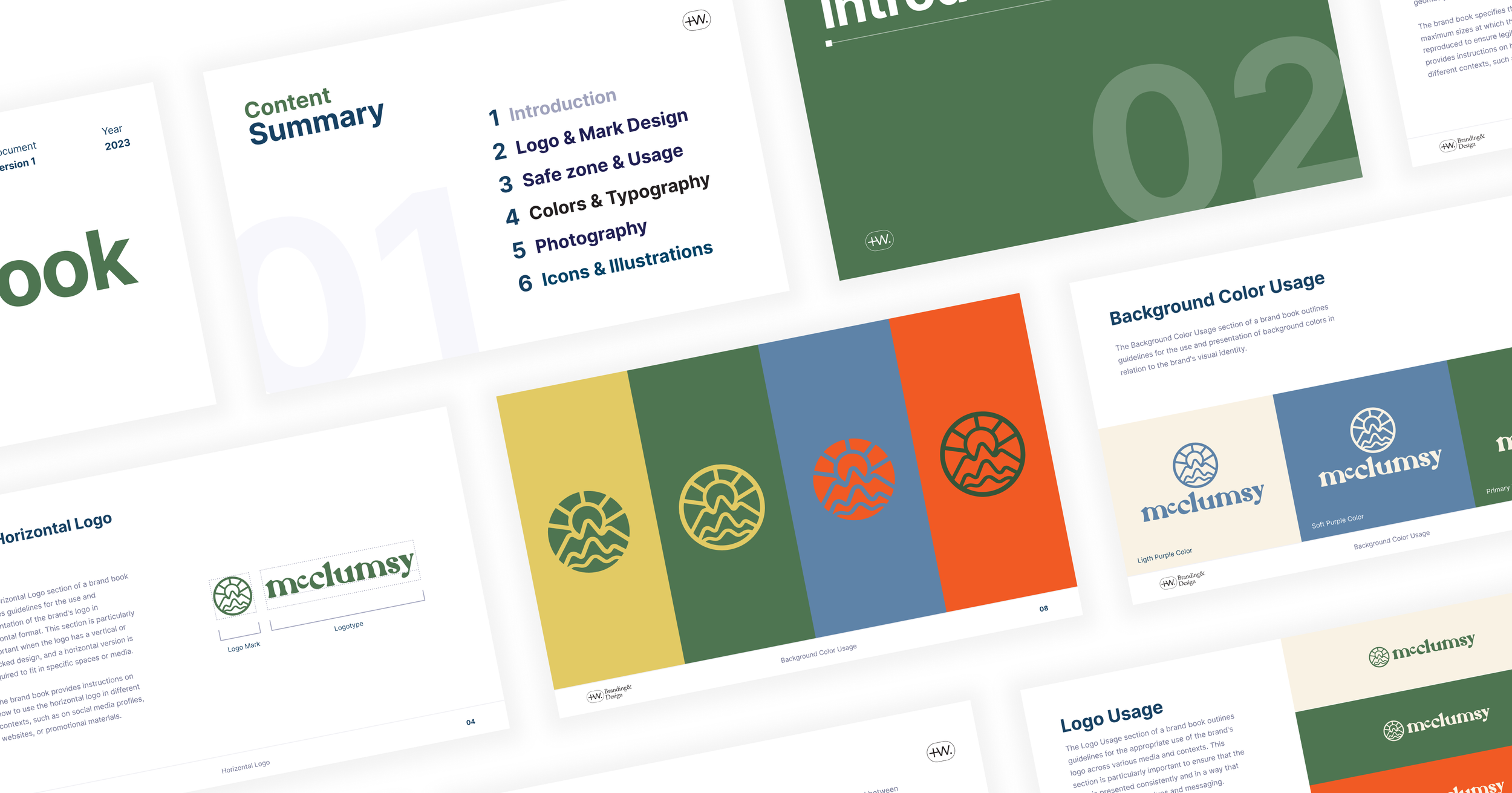
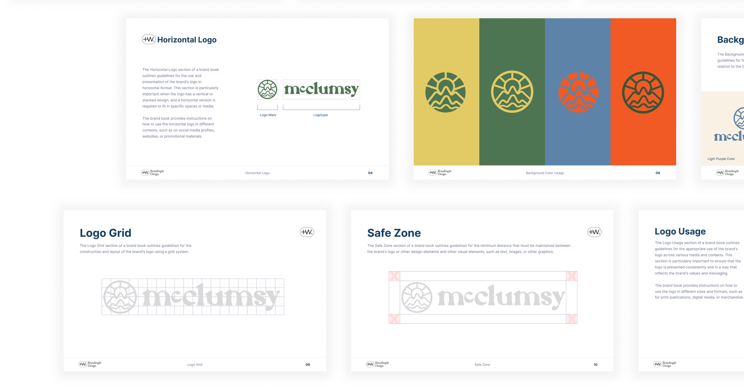
The McClumsy brandmark is a mountain range loosely referencing an “M” character. The "M" is simple and bold, creating a mountain range that is dynamic and playful. Combining the two elements creates a mark that is unique and memorable.
We used a limited color palette of greens, yellows, blues, and orange to create a clean and modern look that references the mountains. These colors can be switched for an alternate palette to invoke a more coastal feeling.
We chose a custom serif typeface that is modern and adds to the playful and clumsy energy. The typeface is used throughout the brand identity system, from the logo to the website to the packaging.


Results
The McClumsy brand identity has been well-received by both the client and their target audience. The mark is simple enough to be easily remembered and scaled to different applications. The color palette and typeface create a clean and modern look that is consistent across all brand materials.
The McClumsy brand identity has helped the client to establish a strong visual presence and connect with their target audience. The brand is now positioned to grow and develop in the future.